

A guide to macOS window toolbar styles in SwiftUI
A macOS window has a toolbar at the top of its frame, displaying the window's title and providing space for controls and other tools that give users access to our app's features. SwiftUI gives us a fair amount of control over how this area is styled, but it is not always easy to find the right modifiers and know what parameters to pass to achieve a specific appearance. Similar results can sometimes be reached through different combinations of scene and view modifiers, which adds to the confusion. So I thought it would be useful to have a single reference for the different ways we can style the toolbar in SwiftUI on macOS 26.
# Toolbar layout and size
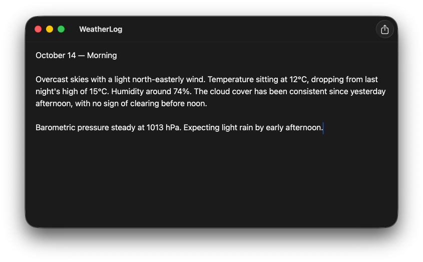
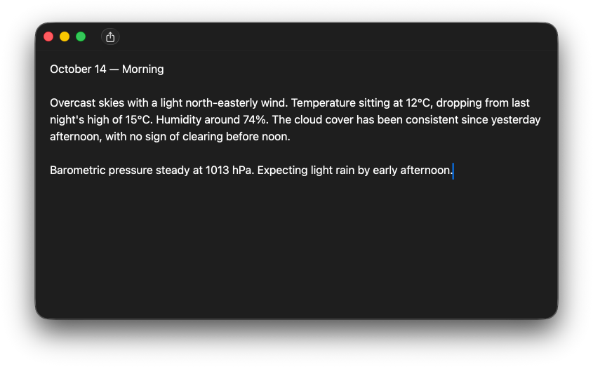
By default, a window's toolbar adopts the automatic toolbar style, which on macOS 26 produces a single horizontal bar at the top of the window, where the title and toolbar items share the same row.
# A compact toolbar
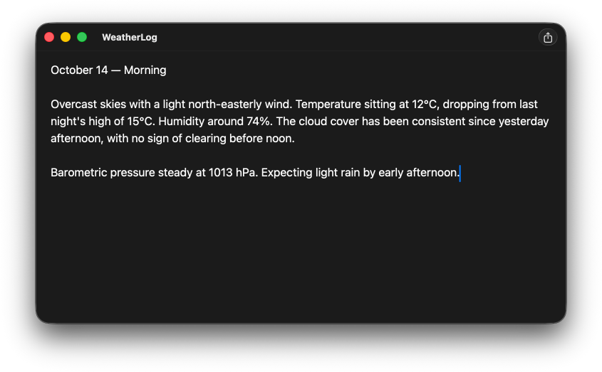
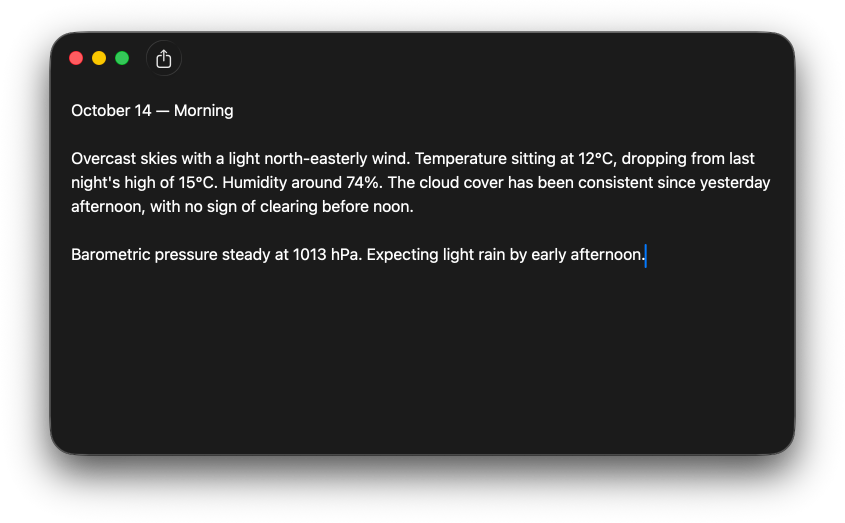
When we want to reduce the height of the toolbar, we can apply windowToolbarStyle(_:) to the respective scene and pass it the unifiedCompact style. This can be a good fit for windows with very few or no toolbar items where we still want to display a title bar without it taking up too much vertical space.
WindowGroup {
    ContentView()
}
.windowToolbarStyle(.unifiedCompact)
# An expanded toolbar
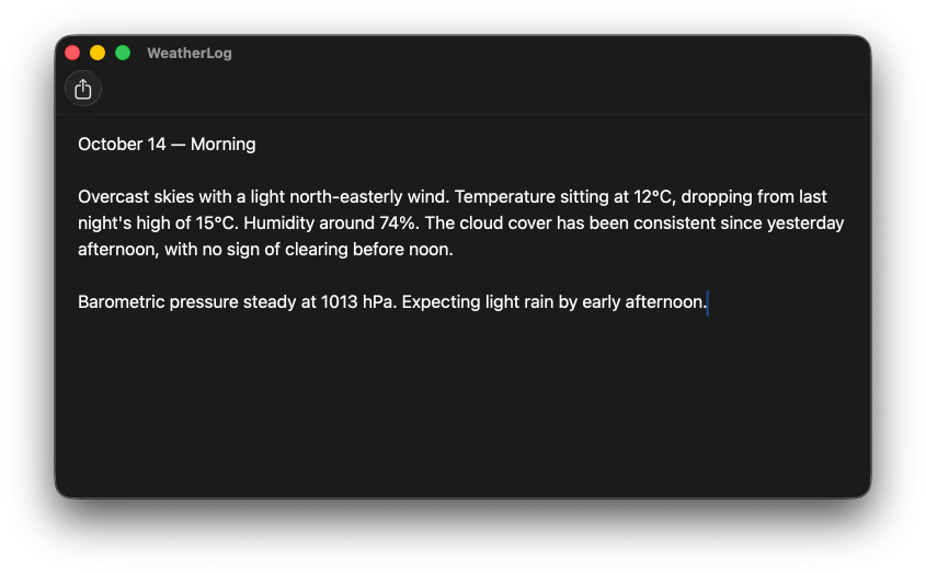
When a window has several toolbar items, a single row can feel cramped. The expanded style addresses this by moving the title to its own row above the toolbar items, giving the toolbar more vertical space overall.
WindowGroup {
    ContentView()
}
.windowToolbarStyle(.expanded)
# Window title visibility
By default, a macOS window displays its title in the toolbar, to the right of the traffic light buttons. SwiftUI gives us several ways to hide the window title, some of which also affect other parts of the toolbar area.
# Hiding the title
We can hide the window title by applying the toolbar(removing:) view modifier to a view inside the window and passing it the title item kind. This removes the title from the toolbar while leaving the toolbar background, the separator, and the traffic light buttons intact.
WindowGroup {
    ContentView()
        .toolbar(removing: .title)
}
Alternatively, if we are already using unified or unifiedCompact as the window toolbar style, we can pass showsTitle: false directly to those styles instead.
WindowGroup {
    ContentView()
}
.windowToolbarStyle(
    .unifiedCompact(showsTitle: false)
)
Note that removing the title may cause toolbar items to reposition depending on their placement.
# Hiding the title bar
To hide the title along with the toolbar background and the separator line, we can apply the windowStyle(_:) modifier to the scene passing it the hiddenTitleBar window style. This is common for windows with a custom background or in apps where the content should expand into the toolbar area.
WindowGroup {
    ContentView()
}
.windowStyle(.hiddenTitleBar)
# Toolbar background
# Clearing the toolbar background
When we want our window's background to extend all the way to the top of the window while keeping the title visible, we need to clear the default toolbar background set by the system. There are a few ways to achieve this, all of which remove both the background and the separator line.
The most explicit approach is to apply the toolbarBackgroundVisibility(_:for:) modifier to a view within the window, passing it hidden for the windowToolbar placement.
WindowGroup {
    ContentView()
        .toolbarBackgroundVisibility(
            .hidden,
            for: .windowToolbar
        )
}
We can also achieve the same result using the toolbarBackground(_:for:) view modifier.
WindowGroup {
    ContentView()
        .toolbarBackground(
            .hidden,
            for: .windowToolbar
        )
}
Passing clear as the style to toolbarBackground(_:for:) also removes the background and separator. While this produces the same visual result as passing hidden, it does so by setting the background to a transparent style rather than explicitly hiding it.
WindowGroup {
    ContentView()
        .toolbarBackground(
            .clear,
            for: .windowToolbar
        )
}
# Setting a custom toolbar background style
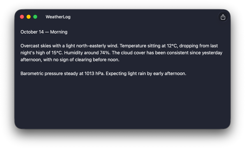
The toolbarBackground(_:for:) view modifier can be used to set any custom style for the window toolbar, which can be useful when we want the toolbar to adopt a specific color that matches our app's visual identity but differs from the background of the window's content area.
WindowGroup {
    ContentView()
        .toolbarBackground(
            .black,
            for: .windowToolbar
        )
}
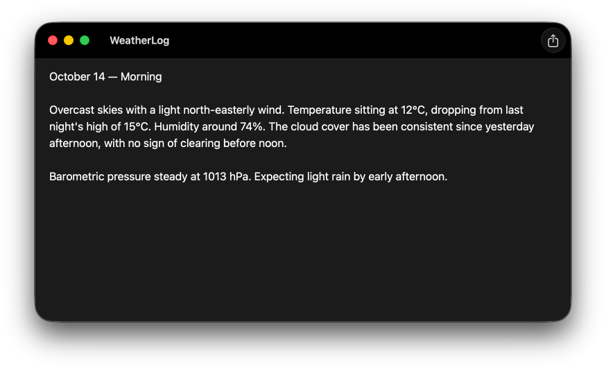
When setting a custom toolbar background color, it may also be a good idea to force a specific color scheme for the toolbar using toolbarColorScheme(_:for:), so that the window title and toolbar items remain visible regardless of the color scheme selected on the user's device.
WindowGroup {
    ContentView()
        .toolbarBackground(.black, for: .windowToolbar)
        .toolbarColorScheme(.dark, for: .windowToolbar)
}
# Toolbar visibility
SwiftUI also provides APIs for controlling visibility of the entire toolbar. If, in some specific cases, we want to remove the toolbar entirely, including the window controls, we can use the toolbarVisibility(_:for:) view modifier.
WindowGroup {
    ContentView()
        .toolbarVisibility(.hidden, for: .windowToolbar)
}
Or we can fine tune the toolbar visibility in full screen mode, for example by making it visible only on hover with the windowToolbarFullScreenVisibility(_:) API.
WindowGroup {
    ContentView()
        .windowToolbarFullScreenVisibility(.onHover)
}
Customizing the appearance and visibility of the macOS window toolbar is a great way to adjust it to fit our app's style and functionality. But it's important to do it sparingly and make sure that each customization has a clear purpose and refines our app without compromising the familiar user experience.
If you are looking to build a strong foundation in SwiftUI, my book SwiftUI Fundamentals takes a deep dive into the framework's core principles and APIs to help you understand how it works under the hood and how to use it effectively in your projects. And my new book The SwiftUI Way helps you adopt recommended patterns, avoid common pitfalls, and use SwiftUI's native tools appropriately to work with the framework rather than against it.
For more resources on Swift and SwiftUI, check out my other books and book bundles.

Work with SwiftUI. Not against it.$35
A field guide to SwiftUI patterns and anti-patterns
The SwiftUI Way
- Avoid common SwiftUI pitfalls
- Build deeper intuition for the framework
- Gain insights from a former SwiftUI Engineer at Apple
Work with SwiftUI. Not against it.
A field guide to SwiftUI patterns and anti-patterns
The SwiftUI Way