

Alignment guides in SwiftUI
SwiftUI layout containers use alignment guides to position views relative to one another. A guide identifies a horizontal or vertical coordinate in a view's local dimensions. During placement, a container reads the relevant guide from each child and places the children so those coordinates coincide.
For example, an HStack uses the vertical center guide by default. It reads that guide from each child and places the children so the reported positions sit on the same horizontal line:
HStack {
    Image(.earth)
        .resizable()
        .scaledToFit()
        .frame(width: 120)

    Image(.mars)
        .resizable()
        .scaledToFit()
        .frame(width: 48)
}
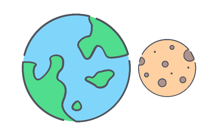
We can choose which vertical alignment guide an HStack uses by passing an alignment to its initializer. For two text views with different font sizes, we might want to align their first text baselines rather than their centers.
HStack(alignment: .firstTextBaseline) {
    Text("42")
        .font(.largeTitle)

    Text("minutes")
        .font(.body)
}


In both examples, the container chooses the guide used for alignment, while SwiftUI supplies the corresponding value for each child. For common layouts, these implicit values are often all we need.
# Overriding a view's alignment guide
Sometimes the default value a child reports for an alignment guide does not mark the point we want its parent to use for alignment. Custom artwork placed alongside text is one example. The rocket image in the code below has no typographic baseline, so SwiftUI uses its bottom edge when the HStack requests the .firstTextBaseline alignment guide.
HStack(alignment: .firstTextBaseline) {
    Image(.rocket)
        .resizable()
        .scaledToFit()
        .frame(width: 48)

    Text("Ready for launch")
        .font(.title2)
}


The bottom of the image, at the tip of the flame, now coincides with the text baseline. This places the rocket body too high relative to the text. Using the bottom of the body as the rocket's baseline would produce better visual alignment, with the flame extending below the text baseline like a descender.
We can override the coordinate a view reports for a specific alignment guide using the alignmentGuide(_:computeValue:) modifier. Here, we return the position at the bottom of the rocket body as the image's .firstTextBaseline value:
HStack(alignment: .firstTextBaseline) {
    Image(.rocket)
        .resizable()
        .scaledToFit()
        .frame(width: 48)
        .alignmentGuide(.firstTextBaseline) { dimensions in
            dimensions.height * 0.81
        }

    Text("Ready for launch")
        .font(.title2)
}


The computeValue closure receives a ViewDimensions value containing the size and alignment guides of the modified view. Because vertical coordinates are measured downward from its top edge, returning 81% of the image height places the guide approximately at the bottom of the rocket body. The HStack then positions the image so this coordinate, rather than its bottom edge, coincides with the text baseline.
SF Symbols already provide baseline guides designed for placement alongside text. Overriding those values can discard their built-in optical alignment. Providing an explicit baseline is more appropriate for custom artwork that has no typographic alignment information of its own.
# Defining a custom alignment guide
Many layouts can be built by selecting one of SwiftUI's alignment guides for a container and, when necessary, changing the value an individual child reports for that guide. Some designs, however, may require views to align around a different reference point that is specific to the layout or its hierarchy.
Consider a launch-sequence event with the following view hierarchy:
HStack {
    Text(time)
        .font(.subheadline.monospacedDigit())
        .foregroundStyle(.secondary)

    Circle()
        .fill(.blue)
        .frame(width: 10, height: 10)

    VStack(alignment: .leading) {
        Text(category)
            .font(.caption)
            .foregroundStyle(.secondary)

        Text(title)
            .font(.headline)

        Text(description)
            .font(.subheadline)
            .foregroundStyle(.secondary)
    }
}
By default, the three children align by their vertical centers, but that does not produce the alignment we want for this design.
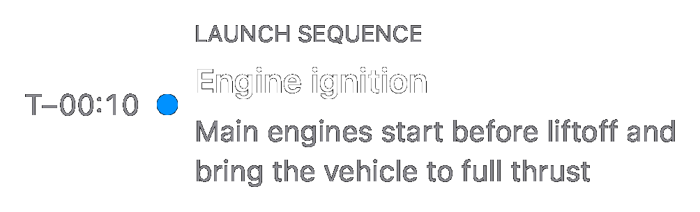
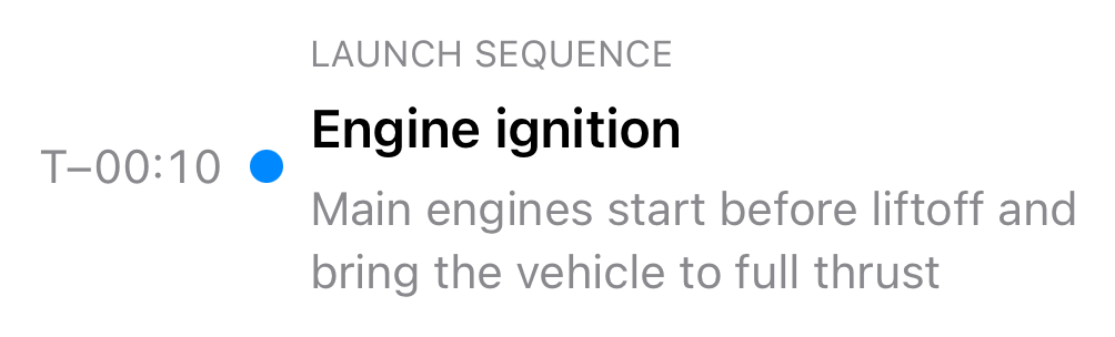
It would be better to align the time text's baseline and the bottom edge of the circle marker with the title's baseline, but this is not straightforward with the existing guides. The title text is not a direct child of the HStack, and none of the guides reported by its wrapping VStack identifies the title's baseline.
We can solve this problem with a custom alignment guide. A custom guide can give a reference point supplied by a nested child a separate identity that an outer container can select for alignment.
We define the custom guide with a type conforming to the AlignmentID protocol. In its defaultValue(in:) method, we return the value a view should report when no explicit value is provided. Here, we use .firstTextBaseline as the default. We then expose the guide as a static value on VerticalAlignment so it can be passed to alignment APIs.
struct EventTitleAlignment: AlignmentID {
    static func defaultValue(
        in dimensions: ViewDimensions
    ) -> CGFloat {
        dimensions[VerticalAlignment.firstTextBaseline]
    }
}

extension VerticalAlignment {
    static let eventTitle = VerticalAlignment(
        EventTitleAlignment.self
    )
}
We can use our custom alignment guide just like a built-in one by passing it to the container's alignment parameter and providing an explicit value on the child that defines the desired reference point.
// Requests .eventTitle from each child.
HStack(alignment: .eventTitle) {
    // Uses the default value: its first text baseline.
    Text(time)
        .font(.subheadline.monospacedDigit())
        .foregroundStyle(.secondary)

    // Uses the default value: its bottom edge.
    Circle()
        .fill(.blue)
        .frame(width: 10, height: 10)

    // Reports the explicit value supplied by the nested title.
    VStack(alignment: .leading) {
        Text(category)
            .font(.caption)
            .foregroundStyle(.secondary)

        Text(title)
            .font(.headline)
            // Reports the title's baseline for .eventTitle.
            .alignmentGuide(.eventTitle) { dimensions in
                dimensions[VerticalAlignment.firstTextBaseline]
            }

        Text(description)
            .font(.subheadline)
            .foregroundStyle(.secondary)
    }
}
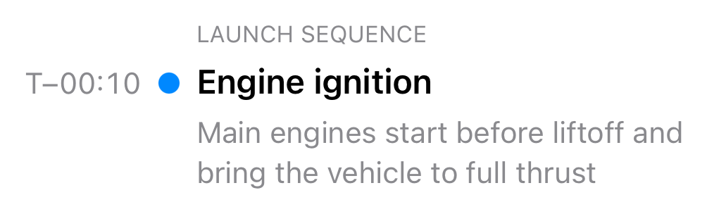
During layout, the HStack requests .eventTitle from each direct child. Neither the time text nor the circle provides an explicit value, so they return the defaults defined by EventTitleAlignment. When SwiftUI requests .eventTitle from the VStack, it finds the explicit value supplied by the title for the same guide. An explicit value from a descendant takes precedence over the guide's default value for the containing view. This is why the VStack does not fall back to its first text baseline and does not need an alignmentGuide modifier of its own.
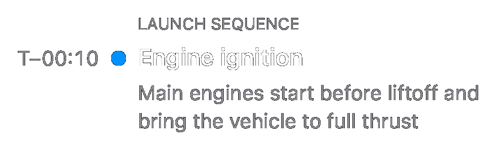
The HStack then places its children so the time's baseline, the circle's bottom edge and the title's projected baseline coincide.
When multiple descendants report explicit values for the same guide, SwiftUI merges them into a single value. When a custom guide is intended to identify one particular reference point, only the view that defines that point should report an explicit value for it.
Alignment guides are a powerful but often underused part of SwiftUI's layout system. They let us describe relationships between views in terms of meaningful points in their content, without relying on frame measurements or fixed offsets. Built-in guides cover common cases, while explicit values and custom guides make the same mechanism adaptable to more specialized layout requirements.
If you are looking to build a strong foundation in SwiftUI, my book SwiftUI Fundamentals takes a deep dive into the framework's core principles and APIs to help you understand how it works under the hood and how to use it effectively in your projects. And my more recent book The SwiftUI Way helps you adopt recommended patterns, avoid common pitfalls, and use SwiftUI's native tools appropriately to work with the framework rather than against it.
For more resources on Swift and SwiftUI, check out my other books and book bundles.
Work with SwiftUI. Not against it.$35
A field guide to SwiftUI patterns and anti-patterns
The SwiftUI Way
- Avoid common SwiftUI pitfalls
- Build deeper intuition for the framework
- Gain insights from a former SwiftUI Engineer at Apple
Work with SwiftUI. Not against it.
A field guide to SwiftUI patterns and anti-patterns
The SwiftUI Way