

Building a sunburst diagram in Swift Charts
A sunburst diagram shows how a total is divided across groups and subgroups in a single view. In this post, we will build one in Swift Charts using sample activity durations. The finished chart shows three levels of detail, keeping related sectors aligned and extending the gaps between categories through the outer rings.
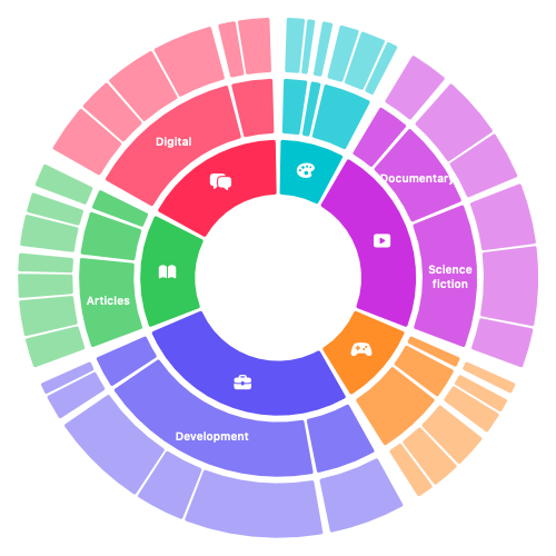
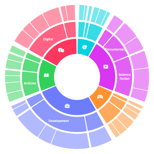
We begin with the top-level breakdown, using sample activity durations already aggregated into six categories. A pie chart lets us show each category's share of the total before introducing the smaller groups that will form the outer rings.
Chart {
    ForEach(layout.topLevelSectors) { sector in
        SectorMark(
            angle: .value("Time", sector.hours)
        )
        .foregroundStyle(
            by: .value("Category", sector.category)
        )
        .accessibilityLabel(sector.category)
        .accessibilityValue(
            "\(sector.hours, format: .number.precision(.fractionLength(0...1))) hours"
        )
    }
}
Each SectorMark receives the category's duration in hours as its angle value. Swift Charts calculates each sector's share of the full circle from these values, so we do not need to convert the durations into angles ourselves.
We pass the category name as a string to foregroundStyle(by:), leaving Swift Charts to choose a colour for each category. We also give each sector an accessibility label naming its category and an accessibility value with its duration in hours.
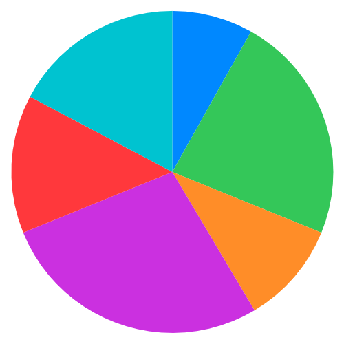
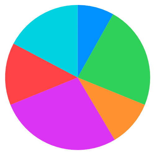
The six sectors fill the circle, with larger sectors representing categories where more time was spent. They all meet at the centre, making the chart feel visually heavy and leaving no open space for a central label or symbol.
To open up the centre, we can give every sector the same inner radius, turning the pie into a ring while preserving each category's share of the total. Reducing the outer radius leaves room for the two outer rings.
let innerRadius = 0.32
let ringWidth = 0.21
let outerRadius = innerRadius + ringWidth

ForEach(layout.topLevelSectors) { sector in
    SectorMark(
        angle: .value("Time", sector.hours),
        innerRadius: .ratio(innerRadius / outerRadius),
        outerRadius: .ratio(outerRadius)
    )
    .foregroundStyle(
        by: .value("Category", sector.category)
    )
}
We describe the ring boundaries using values between 0 at the centre and 1 at the chart's full radius. To fit three equal-width rings, we first reserve space for the central opening and the two gaps between rings, then divide the remaining radius by three. With an opening of 0.32 and gaps of 0.025, each ring has a width of (1 - 0.32 - 2 * 0.025) / 3 = 0.21.
The first ring therefore extends from 0.32 to 0.53 of the full radius. We pass the outer radius directly as .ratio(0.53). The inner radius is relative to that outer edge, so we pass .ratio(0.32 / 0.53), approximately 60.4% of the outer radius.
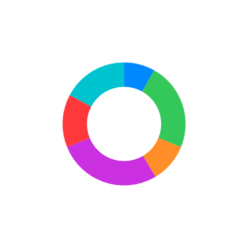
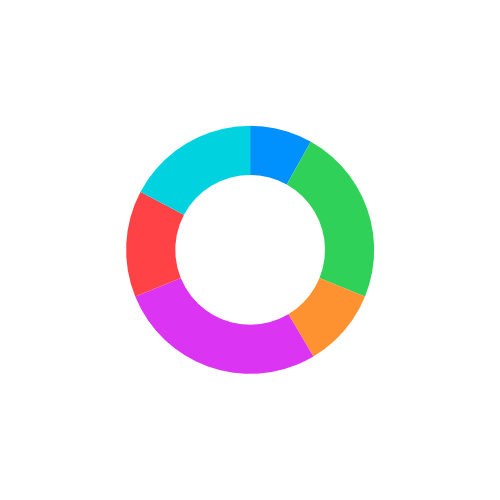
The sectors now form a ring, with open space at the centre and room for the next two rings around the outside. Neighbouring sectors still touch, so their boundaries are defined only by changes in colour.
We can make those boundaries clearer by leaving a small gap between each pair of sectors. A fixed screen-space inset provides that separation without changing the ring dimensions.
let innerRadius = 0.32
let ringWidth = 0.21
let outerRadius = innerRadius + ringWidth

ForEach(layout.topLevelSectors) { sector in
    SectorMark(
        angle: .value("Time", sector.hours),
        innerRadius: .ratio(innerRadius / outerRadius),
        outerRadius: .ratio(outerRadius),
        angularInset: 2
    )
    .foregroundStyle(
        by: .value("Category", sector.category)
    )
}
Unlike the radius ratios, angularInset specifies spacing in points rather than as a proportion of the chart's size. Setting it to 2 introduces a small inset along the straight edges of the sectors, while leaving their duration values and radii unchanged.
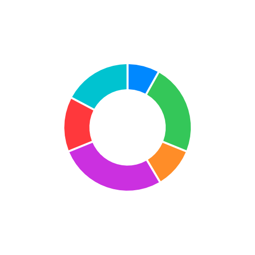
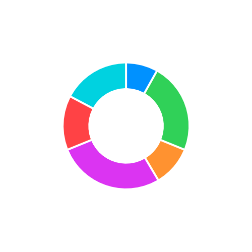
The gaps now separate all six sectors and stay the same width from the inner edge to the outer edge of the ring. They do not widen as they move away from the centre. Now we can expand the example to the full three-level dataset. Each raw record describes a single activity, such as time spent watching a film or making a call, together with the middle- and top-level groups it belongs to. The parent totals can then be derived by aggregating these activity durations.
| Top level | Middle level | Activity | Duration (seconds) |
|---|---|---|---|
| Productivity | Development | Lantern Trails | 13,800 |
| Productivity | Bookkeeping | Mosslight Bakery | 8,100 |
| Social | Digital | Sam | 6,300 |
| Social | In person | Family lunch | 3,600 |
| Entertainment | Science fiction | The Clockwork Aurora | 8,100 |
| Games | Puzzle | Glass Garden | 2,700 |
| Reading & Learning | Articles | Designing Dense Charts | 3,900 |
| Creativity | Photography | Harbour photo walk | 3,000 |
The table contains only activity durations, not parent totals. To find the total for a group, we need to add the durations of its activities.
To plot all three rings, we need to keep those totals together with the groups they belong to. A nested hierarchy lets each parent hold its own total and the children that contribute to it.
import Algorithms
import Foundation

struct ScreenTimeAggregation {
    typealias Level = (name: String, hours: Double)
    typealias MiddleLevel = (
        level: Level,
        details: [Level]
    )
    typealias TopLevel = (
        level: Level,
        middleLevels: [MiddleLevel]
    )

    let topLevels: [TopLevel]

    init(records: [ScreenTimeRecord]) {
        let sortedRecords = Self.sorted(records)
        topLevels = Self.makeTopLevels(from: sortedRecords)
    }
}
The tuples keep this structure compact: each Level stores a name and duration, while MiddleLevel and TopLevel add child arrays. The initializer prepares the hierarchy in two stages, first sorting the records and then building the nested groups.
Building those groups relies on the chunked(on:) operation from Apple's Swift Algorithms package. Because it groups consecutive values, records belonging to the same branch need to sit together from the top-level category down to the individual activity.
private extension ScreenTimeAggregation {
    static func sorted(
        _ records: [ScreenTimeRecord]
    ) -> [ScreenTimeRecord] {
        records.sorted(using: [
            KeyPathComparator(\.topLevel.rawValue),
            KeyPathComparator(\.middleLevel),
            KeyPathComparator(\.activity)
        ])
    }
}
The comparators sort by top-level category, then middle-level category, and finally activity. Each comparator breaks ties left by the previous one, keeping the records for every branch together. We can then group them by top-level category.
private extension ScreenTimeAggregation {
    static func makeTopLevels(
        from records: some Collection<ScreenTimeRecord>
    ) -> [TopLevel] {
        records.chunked(on: \.topLevel).map { category, records in
            (
                level: (
                    name: category.rawValue,
                    hours: totalHours(in: records)
                ),
                middleLevels: makeMiddleLevels(from: records)
            )
        }
    }
}
The chunked(on: \.topLevel) operation divides the sorted records into one subsequence for each category. Each subsequence becomes a complete branch, producing the parent total and supplying the records used to build that parent's middle-level groups.
Within each branch, we repeat the grouping operation to build its middle level.
private extension ScreenTimeAggregation {
    static func makeMiddleLevels(
        from records: some Collection<ScreenTimeRecord>
    ) -> [MiddleLevel] {
        records.chunked(on: \.middleLevel).map { name, records in
            (
                level: (
                    name: name,
                    hours: totalHours(in: records)
                ),
                details: makeDetails(from: records)
            )
        }
    }
}
Each middle-level group now contains only its own activities. These records are the leaves of the hierarchy, so no further grouping is needed. We only need to convert their durations into hours.
private extension ScreenTimeAggregation {
    static func makeDetails(
        from records: some Collection<ScreenTimeRecord>
    ) -> [Level] {
        records.map { record in
            (
                name: record.activity,
                hours: record.duration / 3_600
            )
        }
    }

    static func totalHours(
        in records: some Collection<ScreenTimeRecord>
    ) -> Double {
        records.reduce(0) { $0 + $1.duration } / 3_600
    }
}
Each detail keeps the activity name and divides its duration by 3_600, the number of seconds in an hour. The parent-building methods use totalHours(in:) to add their raw durations before performing the same conversion. All three levels therefore use hours.
We can now plot the category totals, middle-level totals and individual activities as three rings. Each ring needs its own radial band, with room for the central opening and a small gap between rings.
private let rings = RingMetrics.resolve(
    levelCount: 3,
    centerRadius: 0.32,
    levelSpacing: 0.025
)

Chart {
    ForEach(layout.topLevelSectors) { sector in
        SectorMark(
            angle: .value("Top-level time", sector.hours),
            innerRadius: .ratio(
                rings[0].innerRadiusRelativeToOuter
            ),
            outerRadius: .ratio(rings[0].outerRadius),
            angularInset: 2
        )
        .foregroundStyle(
            by: .value("Category", sector.category)
        )
    }

    ForEach(layout.middleLevelSectors) { sector in
        SectorMark(
            angle: .value("Middle-level time", sector.hours),
            innerRadius: .ratio(
                rings[1].innerRadiusRelativeToOuter
            ),
            outerRadius: .ratio(rings[1].outerRadius),
            angularInset: 2
        )
        .foregroundStyle(
            by: .value("Category", sector.category)
        )
    }

    ForEach(layout.detailSectors) { sector in
        SectorMark(
            angle: .value("Detailed time", sector.hours),
            innerRadius: .ratio(
                rings[2].innerRadiusRelativeToOuter
            ),
            outerRadius: .ratio(rings[2].outerRadius),
            angularInset: 2
        )
        .foregroundStyle(
            by: .value("Category", sector.category)
        )
    }
}
Inside the chart, a separate loop plots each level using the corresponding entry in rings for its radii. Passing the top-level category to foregroundStyle(by:) keeps every descendant associated with its main category, while angularInset preserves the fixed screen-space separation.
We can calculate those bands independently of the chart, using the same centre radius and level spacing for all three.
private struct RingMetrics {
    let innerRadius: Double
    let outerRadius: Double

    var innerRadiusRelativeToOuter: Double {
        innerRadius / outerRadius
    }

    static func resolve(
        levelCount: Int,
        centerRadius: Double,
        levelSpacing: Double
    ) -> [RingMetrics] {
        let spacingTotal = levelSpacing * Double(levelCount - 1)
        let levelWidth = (
            1 - centerRadius - spacingTotal
        ) / Double(levelCount)

        return (0..<levelCount).map { level in
            let innerRadius = centerRadius
                + Double(level) * (levelWidth + levelSpacing)

            return RingMetrics(
                innerRadius: innerRadius,
                outerRadius: innerRadius + levelWidth
            )
        }
    }
}
After reserving the central opening and both inter-ring gaps, the helper divides the remaining radius evenly. Each outer ring starts levelSpacing beyond the previous ring's outer edge. The innerRadiusRelativeToOuter property converts the absolute inner boundary into the ratio expected by SectorMark.
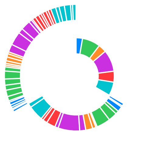
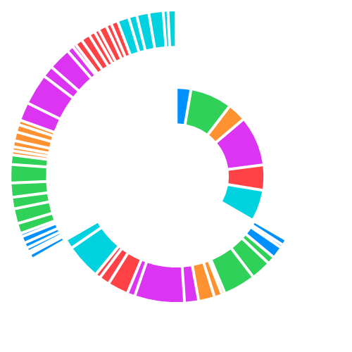
Although the radii are correct, the three rings do not form a hierarchy. Swift Charts creates one angular scale for all the magnitude values in the chart. Because each level totals the same duration, it occupies roughly one third of the circle, with the next level continuing from where the previous one ends.
To keep every ring aligned, each sector needs an explicit start and end value instead of a standalone magnitude. We can describe positions around the circle with the normalized range 0.0..<1.0, where the two ends meet at the chart's seam. Each sector stores these boundaries and exposes them as a range.
struct ScreenTimeSunburstLayout {
    struct Sector {
        let startAngle: Double
        let endAngle: Double

        /* ... Other sector properties ... */

        var angularRange: Range<Double> {
            startAngle..<endAngle
        }
    }

    /* ... Layout preparation ... */
}
These values represent positions within a full turn rather than angles in degrees. For example, the range 0.1..<0.25 occupies 15% of the circle. Keeping both boundaries also gives each sector a range that can be subdivided among its children.
To divide a parent's range, we give each child a share proportional to its duration. The same helper can perform this calculation at every level.
private extension ScreenTimeSunburstLayout {
    static func allocate(
        _ levels: [ScreenTimeAggregation.Level],
        within parentRange: Range<Double>
    ) -> [Range<Double>] {
        let total = levels.reduce(0) { $0 + $1.hours }
        guard total > 0 else { return [] }

        let parentWidth = parentRange.upperBound
            - parentRange.lowerBound

        // Accumulate boundaries using each child's share of the parent.
        var boundaries = levels.reductions(
            parentRange.lowerBound
        ) {
            $0 + parentWidth * $1.hours / total
        }

        // Avoid a rounding gap at the parent's upper boundary.
        boundaries[boundaries.count - 1] = parentRange.upperBound

        // Each neighbouring pair bounds one child sector.
        return boundaries.adjacentPairs().map {
            $0..<$1
        }
    }
}
Swift Algorithms' reductions(_:_:) operation begins at the lower edge of the parent and advances by each level's share of its width. Pairing adjacent results turns those running boundaries into consecutive ranges. We also set the final boundary to the parent's upper edge explicitly, preventing floating-point accumulation from leaving a small gap.
At the top level, the parent range is the complete 0.0..<1.0 turn. We pair the returned ranges with the categories in the same order, then store both boundaries on each sector.
let topLevelRanges = Self.allocate(
    aggregation.topLevels.map(\.level),
    within: 0.0..<1.0
)

for (topLevel, topLevelRange) in zip(
    aggregation.topLevels,
    topLevelRanges
) {
    preparedTopLevels.append(
        Sector(
            /* ... Other properties ... */
            startAngle: topLevelRange.lowerBound,
            endAngle: topLevelRange.upperBound
        )
    )

    /* ... Prepare children within topLevelRange ... */
}
Each category now has a range proportional to its total duration. Still inside the top-level loop, we pass that range to the same helper to divide it among the category's middle-level groups. Their durations are rescaled to fit this smaller range rather than the full circle.
let middleLevelRanges = Self.allocate(
    topLevel.middleLevels.map(\.level),
    within: topLevelRange
)

for (middleLevel, middleLevelRange) in zip(
    topLevel.middleLevels,
    middleLevelRanges
) {
    preparedMiddleLevels.append(
        Sector(
            /* ... Other properties ... */
            startAngle: middleLevelRange.lowerBound,
            endAngle: middleLevelRange.upperBound
        )
    )

    /* ... Prepare details within middleLevelRange ... */
}
The middle-level sectors fill their parent's range. We can divide each middle-level range once more among its individual activities.
let detailRanges = Self.allocate(
    middleLevel.details,
    within: middleLevelRange
)

for (detail, detailRange) in zip(
    middleLevel.details,
    detailRanges
) {
    preparedDetails.append(
        Sector(
            /* ... Other properties ... */
            startAngle: detailRange.lowerBound,
            endAngle: detailRange.upperBound
        )
    )
}
The detail ranges complete the layout. All three levels now have stored start and end values, so we can pass their ranges directly to angle. Swift Charts places each mark at those boundaries instead of appending it after the preceding magnitude.
SectorMark(
    angle: .value(
        "Top-level time",
        sector.angularRange
    ),
    innerRadius: .ratio(
        rings[0].innerRadiusRelativeToOuter
    ),
    outerRadius: .ratio(rings[0].outerRadius)
)
.foregroundStyle(
    by: .value("Category", sector.category)
)

/* ... Plot the middle-level and detail ranges ... */
The same change applies to the middle-level and detail marks; each uses its stored range and the radii for its ring.
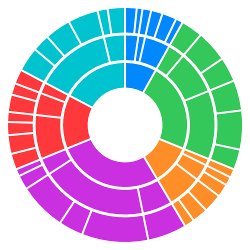
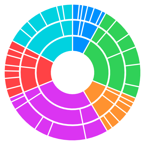
The category boundaries now line up across three complete rings. Within each category, the outer rings show progressively smaller groups. The gaps remain the same width from the inside to the outside of each ring.
Turn app data into insight$35
Build clear, beautiful, and interactive visualizations with Swift Charts
Swift Charts Beyond the Basics
- Reveal patterns and relationships in complex app data
- Create custom charts that stay responsive and accessible
Turn app data into insight
Build clear, beautiful, and interactive visualizations with Swift Charts
Swift Charts Beyond the Basics
The top-level categories still rely on colour alone. I like to use Sim Daltonism to review my charts with simulations of different types of colour blindness and check whether the content remains clear when colours are harder to distinguish.
Adding an SF Symbol to each inner sector gives those categories a second visual identifier. The direct approach is to attach an overlay annotation to the visible sector.
ForEach(layout.topLevelSectors) { sector in
    SectorMark(
        angle: .value(
            "Top-level time",
            sector.angularRange
        ),
        innerRadius: .ratio(
            rings[0].innerRadiusRelativeToOuter
        ),
        outerRadius: .ratio(rings[0].outerRadius)
    )
    .foregroundStyle(
        by: .value("Category", sector.category)
    )
    .annotation(position: .overlay) {
        Image(systemName: sector.category.symbolName)
    }
}
Swift Charts positions an overlay annotation relative to the mark's rectangular bounds. Without an explicit alignment, the icon is centred in that frame.
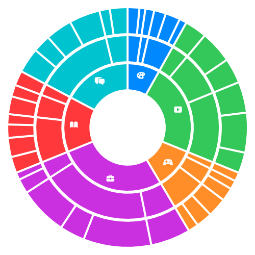
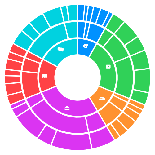
The icons do not sit along a shared centre line through the ring. Some are noticeably closer to a sector edge.
Drawing a rectangle around one sector shows the frame used to place its annotation.
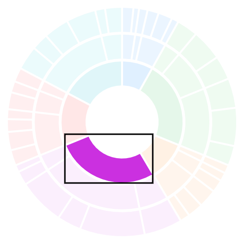
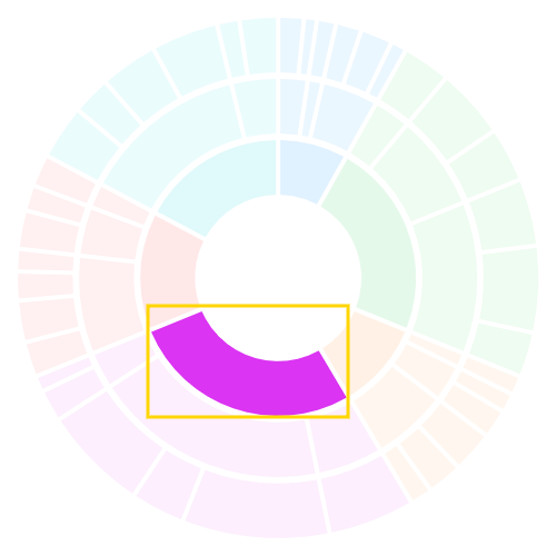
As a sector's angle and width change, so does the centre of its enclosing rectangle. That centre is not a reliable position for a label that should sit halfway through the ring.
To choose the label position ourselves, we can attach the annotation to a tiny sector used only as an anchor. Its angular range needs to be centred between the visible sector's start and end angles.
struct Sector {
    let startAngle: Double
    let endAngle: Double

    /* ... Other sector properties ... */

    var labelAnchorRange: Range<Double> {
        let midpoint = (startAngle + endAngle) / 2
        let halfWidth = 0.000_1
        return (midpoint - halfWidth)..<(midpoint + halfWidth)
    }
}
Averaging the start and end angles gives us the angular midpoint. Extending the range by just 0.000_1 on either side gives us a narrow sector to plot.
The anchor also needs to sit halfway through the ring rather than span its full radial depth. We can create a similarly thin radial band centred between the ring's inner and outer edges.
extension RingMetrics {
    var labelAnchor: RingMetrics {
        let radius = (innerRadius + outerRadius) / 2
        let halfThickness = 0.000_1

        return RingMetrics(
            innerRadius: radius - halfThickness,
            outerRadius: radius + halfThickness
        )
    }
}
The resulting band is centred halfway between the ring's edges. Returning it as another RingMetrics value lets the mark reuse the existing inner-radius conversion.
With both ranges prepared, we can plot a transparent anchor alongside each visible sector and attach the annotation to it.
ForEach(layout.topLevelSectors) { sector in
    SectorMark(
        /* ... Existing visible sector values ... */
    )

    SectorMark(
        angle: .value(
            "Top-level label anchor",
            sector.labelAnchorRange
        ),
        innerRadius: .ratio(
            rings[0].labelAnchor.innerRadiusRelativeToOuter
        ),
        outerRadius: .ratio(
            rings[0].labelAnchor.outerRadius
        )
    )
    .opacity(0)
    .annotation(position: .overlay) {
        Image(systemName: sector.category.symbolName)
            .accessibilityHidden(true)
    }
    .accessibilityHidden(true)
}
The two narrow ranges give the anchor a tiny bounding frame centred at the chosen label position. Setting its opacity to zero hides the anchor. We also hide both it and its annotation from accessibility, so VoiceOver users do not hear the same data twice.
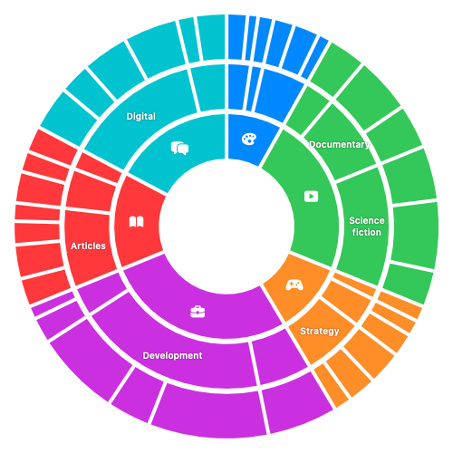
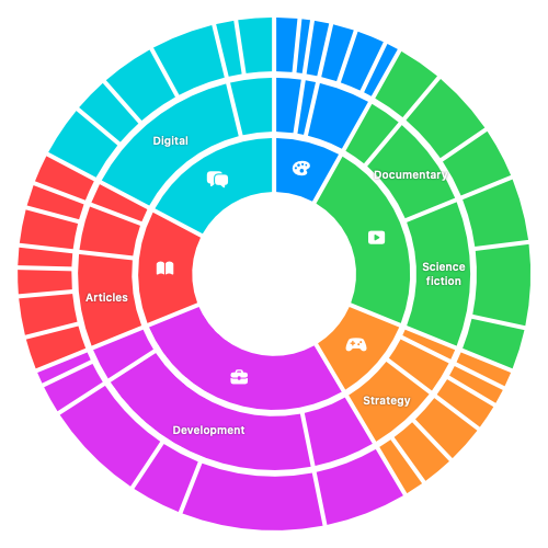
The symbols now line up along the centre of the inner ring, and the selected middle-level labels sit halfway between their ring's edges.
To make each branch easier to follow, we can choose its base colour explicitly and reduce the opacity for each outer level.
Chart {
    ForEach(layout.topLevelSectors) { sector in
        SectorMark(
            /* ... Existing top-level sector values ... */
        )
        .foregroundStyle(
            by: .value("Category", sector.category)
        )
    }

    ForEach(layout.middleLevelSectors) { sector in
        SectorMark(
            /* ... Existing middle-level sector values ... */
        )
        .foregroundStyle(
            by: .value("Category", sector.category)
        )
        .opacity(0.78)
    }

    ForEach(layout.detailSectors) { sector in
        SectorMark(
            /* ... Existing detail sector values ... */
        )
        .foregroundStyle(
            by: .value("Category", sector.category)
        )
        .opacity(0.52)
    }
}
.chartForegroundStyleScale(
    mapping: { (category: ScreenTimeCategory) in
        switch category {
        case .productivity:
            .indigo
        case .social:
            .pink
        case .entertainment:
            .purple
        case .games:
            .orange
        case .readingAndLearning:
            .green
        case .creativity:
            .teal
        }
    }
)
Every mark still passes its top-level category to foregroundStyle(by:), so one chart-level mapping supplies the colour for a whole branch. The inner ring stays fully opaque, while the middle and outer rings become progressively less opaque.
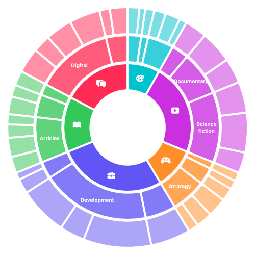
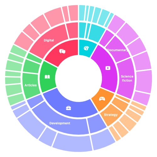
The inner ring now stands out most strongly, while the outer rings are more subdued. Each branch keeps a recognizable colour as it divides into smaller groups.
Fixed screen-space insets still create parallel-sided gaps. We can separate the main categories more clearly by making their gaps widen outwards through all three rings. This requires insetting each parent range before dividing the remaining space among its children.
let topLevelRanges = Self.allocate(
    aggregation.topLevels.map(\.level),
    within: 0.0..<1.0
)

for (topLevel, allocatedRange) in zip(
    aggregation.topLevels,
    topLevelRanges
) {
    let topLevelRange = Self.inset(
        allocatedRange,
        by: 0.006
    )
    /* ... Create the top-level sector ... */
}
The inset topLevelRange sets both the visible sector's boundaries and the space available to its children. Allocating the children inside this range keeps them out of the main gaps.
Inside each top-level range, we allocate the middle-level sectors and give each one its own smaller inset.
let middleLevelRanges = Self.allocate(
    topLevel.middleLevels.map(\.level),
    within: topLevelRange
)

for (middleLevel, allocatedRange) in zip(
    topLevel.middleLevels,
    middleLevelRanges
) {
    let middleLevelRange = Self.inset(
        allocatedRange,
        by: 0.003
    )
    /* ... Create the middle-level sector ... */
}
Each middle-level sector is now inset within its already-inset parent. We pass this narrower middleLevelRange to the helper when allocating the details, so they stay clear of the gaps at both levels.
let detailRanges = Self.allocate(
    middleLevel.details,
    within: middleLevelRange
)

for (detail, allocatedRange) in zip(
    middleLevel.details,
    detailRanges
) {
    let detailRange = Self.inset(
        allocatedRange,
        by: 0.001_5
    )
    /* ... Create the detail sector ... */
}
Using the smaller 0.001_5 padding keeps the outer gaps restrained, because the same angular width occupies more screen space farther from the centre.
A fixed angular padding could erase a very narrow sector, so we also need to limit the inset.
private static func inset(
    _ range: Range<Double>,
    by angularPadding: Double
) -> Range<Double> {
    let width = range.upperBound - range.lowerBound
    let inset = min(angularPadding / 2, width * 0.45)
    return (range.lowerBound + inset)..<(range.upperBound - inset)
}
To avoid an empty or reversed range, the helper caps each inset at 45% of the range width. This preserves at least 10% of even a narrow sector after removing padding from both sides.
Once the top-level ranges have been inset, no visible sector reaches both ends of the 0.0..<1.0 domain. If Swift Charts inferred its angular domain from only those ranges, it would expand them and close the gap at the seam. An invisible mark can preserve the full domain.
SectorMark(
    angle: .value(
        "Full angular domain",
        0.0..<1.0
    ),
    innerRadius: .ratio(0),
    outerRadius: .ratio(0)
)
.foregroundStyle(.clear)
.accessibilityHidden(true)
With both radii set to zero, this mark contributes the domain endpoints without drawing anything. It is also hidden from accessibility because it does not represent an activity.
The sector and its label anchor can now read from the final inset range.
ForEach(layout.topLevelSectors) { sector in
    SectorMark(
        angle: .value(
            "Top-level time",
            sector.angularRange
        ),
        innerRadius: .ratio(
            rings[0].innerRadiusRelativeToOuter
        ),
        outerRadius: .ratio(rings[0].outerRadius)
    )

    SectorMark(
        angle: .value(
            "Top-level label anchor",
            sector.labelAnchorRange
        ),
        innerRadius: .ratio(
            rings[0].labelAnchor.innerRadiusRelativeToOuter
        ),
        outerRadius: .ratio(
            rings[0].labelAnchor.outerRadius
        )
    )
    .opacity(0)
    .annotation(position: .overlay) {
        Image(systemName: sector.category.symbolName)
            .accessibilityHidden(true)
    }
    .accessibilityHidden(true)
}

/* ... Apply the same ranges to the remaining rings and labels ... */
The anchor's midpoint is calculated from the same inset range as the visible sector, so its label stays centred when the boundaries move. We use the same pairing for the remaining rings.
Broad radial gaps now separate the six main categories and continue through every descendant ring. Smaller gaps distinguish groups within each branch.
Visually, the aligned rings let us follow a branch from its category to its activities. For VoiceOver, the order of the data matters too. The three separate loops create all top-level marks first, followed by all middle-level marks and then all details, separating parents from their children.
We can instead build one array in depth-first order: append a category, then each middle-level group followed immediately by its activities. Each sector also keeps a ringLevel so we know which ring it belongs to.
init(aggregation: ScreenTimeAggregation) {
    var preparedSectors: [Sector] = []
    /* ... Calculate totalHours and topLevelRanges ... */

    for (topLevel, allocatedRange) in zip(
        aggregation.topLevels,
        topLevelRanges
    ) {
        /* ... Create topSector with ringLevel: 0 ... */
        preparedSectors.append(topSector)

        /* ... Allocate middleLevelRanges within topSector ... */
        for (middleLevel, allocatedRange) in zip(
            topLevel.middleLevels,
            middleLevelRanges
        ) {
            /* ... Create middleSector with ringLevel: 1 ... */
            preparedSectors.append(middleSector)

            /* ... Allocate detailRanges within middleSector ... */
            for (detail, allocatedRange) in zip(
                middleLevel.details,
                detailRanges
            ) {
                /* ... Create detailSector with ringLevel: 2 ... */
                preparedSectors.append(detailSector)
            }
        }
    }

    sectors = preparedSectors
}
The nested loops build this order directly, so no additional sort is needed. Each sector's ringLevel lets us choose the same radii and opacity as before.
We can use that array in a single loop for the visible data marks, followed by a separate loop for the label anchors.
Chart {
    /* ... Keep the invisible full-angular-domain mark ... */

    ForEach(layout.sectors) { sector in
        let ring = rings[sector.ringLevel]

        SectorMark(
            angle: .value("Time", sector.angularRange),
            innerRadius: .ratio(ring.innerRadiusRelativeToOuter),
            outerRadius: .ratio(ring.outerRadius)
        )
        .cornerRadius(sectorCornerRadius)
        .foregroundStyle(
            by: .value("Category", sector.category)
        )
        .opacity([1.0, 0.78, 0.52][sector.ringLevel])
        .accessibilityLabel(
            sector.ringLevel == 0
                ? sector.name
                : "\(sector.category.rawValue), \(sector.name)"
        )
        .accessibilityValue(
            "\(sector.hours, format: .number.precision(.fractionLength(0...1))) hours"
        )
    }

    ForEach(layout.sectors) { sector in
        let ring = rings[sector.ringLevel]

        if sector.ringLevel == 0
            || (sector.ringLevel == 1 && sector.angularWidth > 0.055) {
            /* ... Add the existing invisible anchor at
               ring.labelAnchor with its .annotation,
               keeping it hidden from accessibility ... */
        }
    }
}
/* ... Keep the existing chart modifiers ... */
Each sector keeps its ring's radii and opacity, and the small corner radius softens its edges without changing the calculated range. Its accessibility label names the sector, adding the top-level category for child sectors, and its value gives the duration in hours.
The second loop adds only the visual annotation anchors. Keeping these hidden from accessibility avoids making VoiceOver users navigate through duplicate labels.
You can find the sample code for this post on GitHub.
If you are looking to deepen your understanding of Swift Charts and learn how to reason about your data and turn it into beautiful, performant, and accessible charts, take a look at our new book Swift Charts Beyond the Basics. It is a rich, practical reference for building advanced data visualizations with the framework.
For more resources on Swift and SwiftUI, check out our other books and book bundles.
Turn app data into insight$35
Build clear, beautiful, and interactive visualizations with Swift Charts
Swift Charts Beyond the Basics
- Reveal patterns and relationships in complex app data
- Create custom charts that stay responsive and accessible
Turn app data into insight
Build clear, beautiful, and interactive visualizations with Swift Charts
Swift Charts Beyond the Basics