

Presenting SwiftUI sheets on iPhone Duo
On iPhone Duo, sheets can look quite different depending on which display we're using and whether the device is partially folded. A sheet's toolbar controls can move to the side, and the sheet itself can shift away from the fold. If our apps already present sheets, these are behaviors we'll want to check, even if we haven't added any device-specific code.
SwiftUI handles these adaptations automatically, but we can also adjust the sheet placement and toolbar arrangement to suit the content we're presenting.
# Automatic sheet adaptation on iPhone Duo
To see the default behavior, we'll use a photo gallery example where tapping a thumbnail opens a larger image in a sheet. The gallery stores the selected photo in an optional @State property and presents it with the sheet(item:onDismiss:content:) modifier:
struct GalleryView: View {
    @State private var selectedPhoto: AnimalPhoto?

    var body: some View {
        NavigationStack {
            PhotoGrid { photo in
                selectedPhoto = photo
            }
            .navigationTitle("Animal Encounters")
            .sheet(item: $selectedPhoto) { photo in
                PhotoSheet(photo: photo)
            }
        }
    }
}
Our PhotoSheet view contains the image inside a NavigationStack, with a navigation title and a close button. We use the semantic close button role so SwiftUI provides the standard label and appearance for dismissing the sheet. There are no sheet presentation modifiers in this example.
struct PhotoSheet: View {
    @Environment(\.dismiss) private var dismiss

    let photo: AnimalPhoto

    var body: some View {
        NavigationStack {
            PhotoContent(photo: photo)
                .navigationTitle(Text(photo.title))
                .toolbar {
                    Button(role: .close) {
                        dismiss()
                    }
                }
        }
    }
}
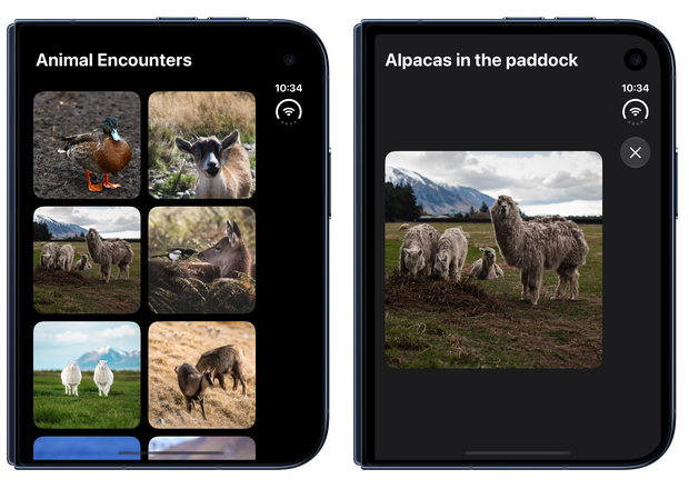
When we build the app with the iOS 27.1 SDK, the standard presentation adapts to iPhone Duo, including support for vertical toolbar controls.
On the outer display, sheets use vertical bars by default, so our close button will appear along the side of the sheet instead of at the top.
On the inner display, a centered sheet uses a horizontal toolbar.
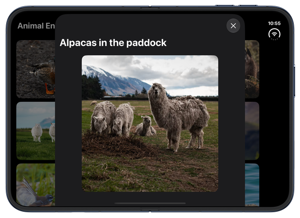
As the device is partially folded, the system moves the sheet away from the fold. This is part of the built-in adaptation, so we don't need to observe the hinge angle or calculate a position ourselves to get this behavior.
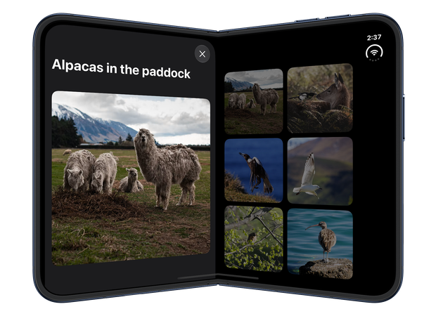
The same sheet content can therefore appear with a different position and toolbar arrangement as the device changes configuration. Before adding any customization, it's worth checking whether these defaults suit the content and actions in our sheet.
# Adjusting sheet placement
If the automatic sheet placement doesn't suit our app, we can adjust it using the presentationPlacement(_:) modifier, available from iOS 27. It accepts automatic, center, leading, or trailing, and we apply it to the sheet content.
Giving a sheet an explicit placement can make it feel more connected to the content it represents. In our gallery, for example, we can use the tapped photo's position in the grid to present its sheet on the same side. In regular width, the grid has four columns: the first two use leading, while the last two use trailing. In compact width, we leave placement as automatic.
struct GalleryView: View {
    @Environment(\.horizontalSizeClass) private var horizontalSizeClass
    @State private var selectedPhoto: AnimalPhoto?

    private var columnCount: Int {
        horizontalSizeClass == .regular ? 4 : 2
    }

    var body: some View {
        NavigationStack {
            PhotoGrid(columnCount: columnCount) { photo in
                selectedPhoto = photo
            }
            .navigationTitle("Animal Encounters")
            .sheet(item: $selectedPhoto) { photo in
                PhotoSheet(photo: photo)
                    .presentationPlacement(placement(for: photo))
            }
        }
    }

    private func placement(for photo: AnimalPhoto) -> PresentationPlacement {
        guard horizontalSizeClass == .regular,
              let index = AnimalPhoto.gallery.firstIndex(where: {
                  $0.id == photo.id
              }) else {
            return .automatic
        }

        let column = index % columnCount
        return column < columnCount / 2 ? .leading : .trailing
    }
}
Tapping a photo in the trailing half of the grid presents its sheet on that side, whether the inner display is fully open or partially folded.
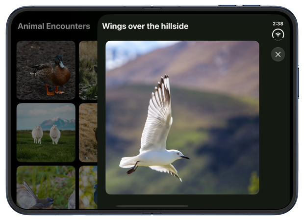
Placement also affects the default toolbar arrangement. According to Apple's guidance for preparing apps for iPhone Duo, sheets on the inner display use horizontal toolbars for centered and leading placements, and vertical toolbars for trailing placement.
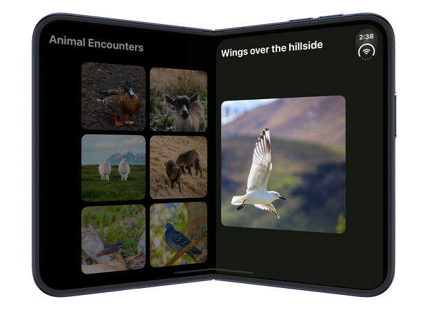
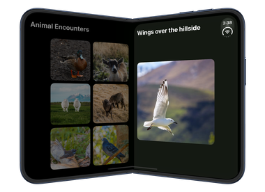
In the current iOS 27.1 beta, however, I encountered an issue with trailing sheets in both configurations. They often didn't adopt the expected vertical toolbar, and their controls could overlap the status bar and camera area.
In the partially folded example below, the close button is obscured by the system status display.
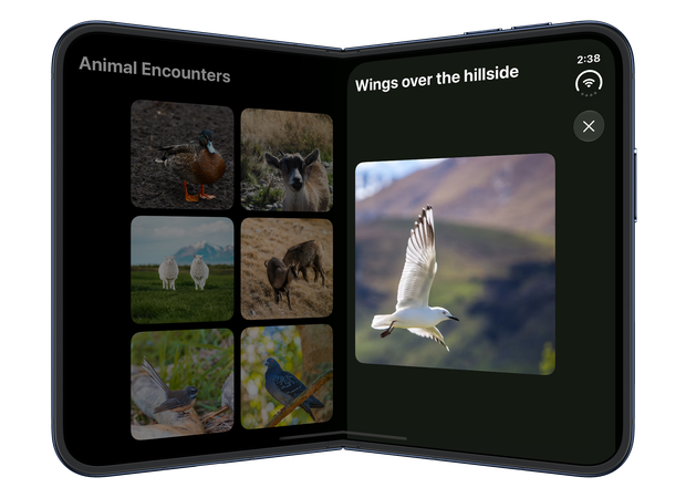
Explicitly setting presentation detents with the presentationDetents(_:) modifier, even with only the large detent, resolved this in my testing.
// Inside GalleryView
.sheet(item: $selectedPhoto) { photo in
    PhotoSheet(photo: photo)
        .presentationPlacement(placement(for: photo))
        .presentationDetents([.large])
}
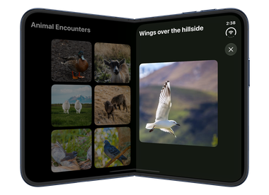
With this change, the close button appears below the status display in the vertical toolbar, while the sheet keeps its trailing placement.
This appears to be a workaround for this beta, rather than a documented requirement for using explicit sheet placement.
# Customizing toolbar arrangement in sheets
We can also customize the toolbar arrangement when the default doesn't suit the sheet's content. Vertical toolbars leave more vertical space for content, but they also take up some of the available width. In our photo sheet, the only toolbar action is the close button, so we might prefer to keep it at the top and give the image more horizontal space.
Starting with iOS 27.1, we can opt out of vertical bars with the toolbarVerticalBehavior(_:) modifier. Setting it to disabled returns toolbar items to the standard horizontal bars.
We can apply the modifier to the content inside the sheet's NavigationStack:
struct PhotoSheet: View {
    @Environment(\.dismiss) private var dismiss

    let photo: AnimalPhoto

    var body: some View {
        NavigationStack {
            PhotoContent(photo: photo)
                .navigationTitle(Text(photo.title))
                .toolbar {
                    Button(role: .close) {
                        dismiss()
                    }
                }
                .toolbarVerticalBehavior(.disabled)
        }
    }
}
This also changes how the sheet fits around the system UI: the sheet stops short of the front-facing camera, and the status bar repositions itself.
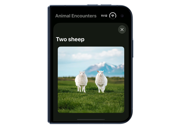
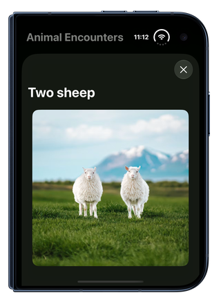
The sheet resolves this preference independently of the presenting view, so the gallery can continue using the default bar arrangement.
Apple recommends keeping vertical bars for most interfaces. If we opt out, we should keep that choice consistent rather than switching the bar arrangement in response to temporary view state.
If you are looking to build a strong foundation in SwiftUI, my book SwiftUI Fundamentals takes a deep dive into the framework's core principles and APIs to help you understand how it works under the hood and how to use it effectively in your projects. And my more recent book The SwiftUI Way helps you adopt recommended patterns, avoid common pitfalls, and use SwiftUI's native tools appropriately to work with the framework rather than against it.
For more resources on Swift and SwiftUI, check out my other books and book bundles.
Work with SwiftUI. Not against it.$35
A field guide to SwiftUI patterns and anti-patterns
The SwiftUI Way
- Avoid common SwiftUI pitfalls
- Build deeper intuition for the framework
- Gain insights from a former SwiftUI Engineer at Apple
Work with SwiftUI. Not against it.
A field guide to SwiftUI patterns and anti-patterns
The SwiftUI Way