

Adaptive SwiftUI toolbars in iOS 27
As our apps become resizable and appear in more contexts and places, the space available for their toolbars can change significantly. SwiftUI adapts a toolbar to its current environment, but until now, we had little control over which actions remained visible when space became limited and which ones moved into overflow.
In iOS 27, new toolbar APIs let us describe these decisions more precisely. We can assign visibility priorities to actions, place secondary commands directly in overflow, pin an important item to the trailing edge and control how a toolbar minimizes while people scroll. In this post, we'll look at how these additions help toolbars adapt while preserving the relative importance of their actions.
# Visibility priorities for toolbar items
When there isn't enough space to display every toolbar item, SwiftUI can move some of them into an overflow menu. By default, all items have the same automatic visibility priority, so the system has no information about which actions are more important to our app.
For example, a palette detail view can provide actions for duplicating and favoriting a palette, copying its name and colors, and sharing it:
PaletteOverviewView(palette: palette)
    .toolbar {
        ToolbarItem {
            DuplicatePaletteButton(palette: palette)
        }

        ToolbarItemGroup {
            CopyPaletteNameButton(palette: palette)
            CopySwiftUIColorsButton(palette: palette)
            CopyHexValuesButton(palette: palette)
        }

        ToolbarItem {
            FavoritePaletteButton(palette: palette)
        }

        ToolbarItem {
            ShareLink(item: palette.title)
        }
    }
All of the items use the automatic priority. In a compact presentation, SwiftUI keeps the earlier actions visible and moves the last copy action, Favorite and Share into overflow. It doesn't know that Favorite is part of the primary browsing flow and should remain readily accessible.
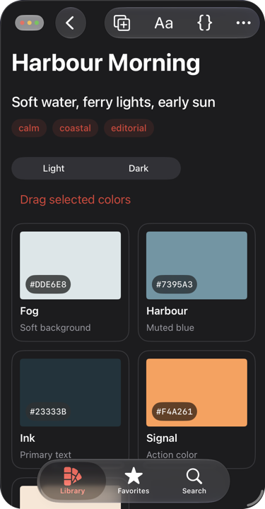
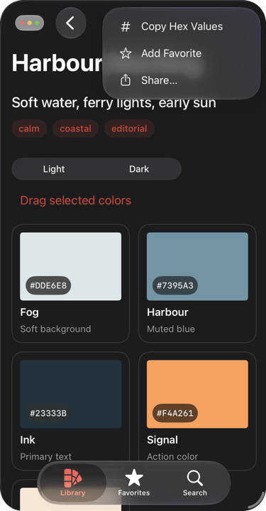
To keep Favorite visible for longer, we can apply the visibilityPriority(_:) modifier to its ToolbarItem:
ToolbarItem {
    FavoritePaletteButton(palette: palette)
}
.visibilityPriority(.high)
The modifier changes how readily a piece of toolbar content moves into overflow. After assigning a high priority to Favorite, SwiftUI keeps it in the toolbar and moves actions with the automatic priority into overflow first.
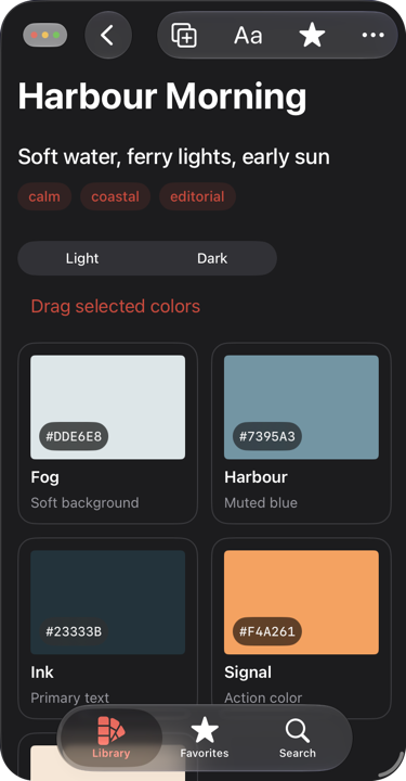
ToolbarItemVisibilityPriority provides the automatic, low and high values on iOS. We can also create priorities relative to an existing value when a toolbar needs more than three levels of importance:
extension ToolbarItemVisibilityPriority {
    static let editing = Self(lowerThan: .high)
    static let formatting = Self(lowerThan: .editing)
}
A visibility priority doesn't reserve space or guarantee that an item will remain visible. It gives SwiftUI an ordering to follow when deciding which toolbar content should move into overflow first. The modifier can be applied to a single ToolbarItem or to a ToolbarItemGroup when its actions share the same importance.
# Keeping secondary commands in overflow
Some commands don't need to appear directly in the toolbar even when there is enough space for them. In our example, the three copy actions are useful, but they are secondary to the actions for working with the palette itself. We can place them in a ToolbarOverflowMenu:
PaletteOverviewView(palette: palette)
    .toolbar {
        ToolbarItem {
            DuplicatePaletteButton(palette: palette)
        }

        ToolbarOverflowMenu {
            CopyPaletteNameButton(palette: palette)
            CopySwiftUIColorsButton(palette: palette)
            CopyHexValuesButton(palette: palette)
        }

        ToolbarItem {
            FavoritePaletteButton(palette: palette)
        }
        .visibilityPriority(.high)

        ToolbarItem {
            ShareLink(item: palette.title)
        }
    }
Unlike toolbar content with a low visibility priority, the commands inside ToolbarOverflowMenu don't appear in the bar when more space becomes available. They always remain in the overflow menu, giving the visible actions a more stable layout as the available width changes.
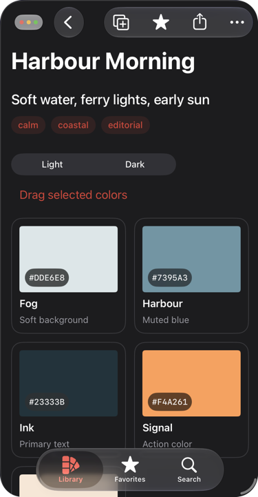
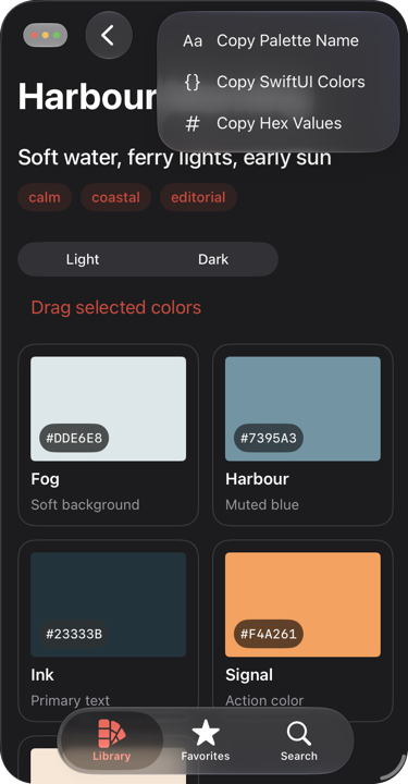
We can also add the same kind of menu separately from the main toolbar modifier by using toolbarOverflowMenu(content:):
PaletteOverviewView(palette: palette)
    .toolbar {
        // Visible toolbar items
    }
    .toolbarOverflowMenu {
        CopyPaletteNameButton(palette: palette)
        CopySwiftUIColorsButton(palette: palette)
        CopyHexValuesButton(palette: palette)
    }
Both forms produce the same overflow menu. The ToolbarOverflowMenu form is convenient when we want to describe all toolbar content together, while the modifier is useful when the secondary commands are added from another part of the view hierarchy.
# Pinning an action to the trailing edge
A high visibility priority tells SwiftUI which actions should move into overflow last, but it still allows the system to make the final decision. When an action must occupy the trailing position, we can instead place it in topBarPinnedTrailing:
ToolbarItem(placement: .topBarPinnedTrailing) {
    ShareLink(item: palette.title)
}
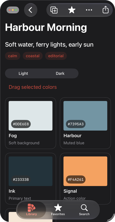
The pinned item stays at the trailing edge as the toolbar becomes narrower, while other items can move into overflow around it. This makes the placement suitable for an action that should remain both visible and spatially stable. It is a stronger commitment than assigning a high visibility priority, so it should be reserved for an action that truly needs that position.
Pinned items can still move into overflow while search is active if there isn't enough room for them alongside the search interface.
# Minimizing the navigation bar while scrolling
Toolbars can also adapt as people move through scrollable content. The toolbarMinimizationBehavior(_:for:) modifier lets us control when a toolbar minimizes in response to scrolling:
PaletteOverviewView(palette: palette)
    .toolbarMinimizationBehavior(
        .onScrollDown,
        for: .navigationBar
    )
We can use onScrollDown to minimize the navigation bar when scrolling down, onScrollUp to minimize it in the opposite direction, and never to prevent minimization. With automatic, SwiftUI chooses an appropriate behavior for the current context.
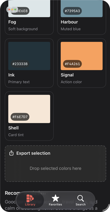
By default, the safe area adjusts as the navigation bar minimizes, allowing the content to move into the space it leaves behind. We can keep the content's safe area unchanged instead with toolbarMinimizationSafeAreaAdjustment(_:for:):
.toolbarMinimizationBehavior(
    .onScrollDown,
    for: .navigationBar
)
.toolbarMinimizationSafeAreaAdjustment(
    .disabled,
    for: .navigationBar
)
Disabling the adjustment is useful when content extends underneath the navigation bar and should remain in place as the bar minimizes. For content that should reflow into the newly available space, we can keep the default automatic value or explicitly use enabled.
We can also change when the minimized bar returns. Normally it restores when the person reverses the scrolling direction. The toolbarMinimizationRestoration(_:for:) modifier can defer restoration until the content reaches the scroll edge:
.toolbarMinimizationRestoration(
    .atScrollEdge,
    for: .navigationBar
)
# Other toolbar additions
iOS 27 includes a few smaller additions that make toolbar content easier to configure.
We can remove the default padding around an item whose content should extend to its edges with contentMarginsRemoved(_:):
ToolbarItem {
    PalettePreview(palette: palette)
}
.contentMarginsRemoved()
The status bar is now represented by ToolbarPlacement.statusBar, so its visibility can be controlled through the same toolbar API as other bars:
.toolbarVisibility(.hidden, for: .statusBar)
This replaces the older statusBarHidden(_:) modifier on iOS 27.
ForEach now conforms to ToolbarContent, which means we can generate toolbar items directly from a collection:
.toolbar {
    ForEach(quickActions) { action in
        ToolbarItem {
            Button(action.title, systemImage: action.systemImage) {
                action.perform()
            }
        }
    }
}
EmptyView conforms to ToolbarContent as well, so a toolbar content builder can use it to represent an explicitly empty branch.
When built with the iOS 27 SDK, the ForEach conformance back-deploys to iOS 16. The EmptyView conformance and the other APIs discussed in this post require iOS 27.
Together, these APIs let us express how toolbar content should respond as its available space and surrounding interface change. This gives SwiftUI the information it needs to adapt our toolbars across resizable windows without requiring us to design a separate toolbar for every possible width.
If you are looking to build a strong foundation in SwiftUI, my book SwiftUI Fundamentals takes a deep dive into the framework's core principles and APIs to help you understand how it works under the hood and how to use it effectively in your projects. And my more recent book The SwiftUI Way helps you adopt recommended patterns, avoid common pitfalls, and use SwiftUI's native tools appropriately to work with the framework rather than against it.
For more resources on Swift and SwiftUI, check out my other books and book bundles.
Work with SwiftUI. Not against it.$35
A field guide to SwiftUI patterns and anti-patterns
The SwiftUI Way
- Avoid common SwiftUI pitfalls
- Build deeper intuition for the framework
- Gain insights from a former SwiftUI Engineer at Apple
Work with SwiftUI. Not against it.
A field guide to SwiftUI patterns and anti-patterns
The SwiftUI Way