

Visualising data with a hexagonal heatmap in Swift Charts
When creating charts of spatial data, readings are commonly aggregated into approximately equal-area cells to form a heatmap. In this post, we will use Swift Charts to plot earthquakes across Aotearoa New Zealand with hexagonal cells.
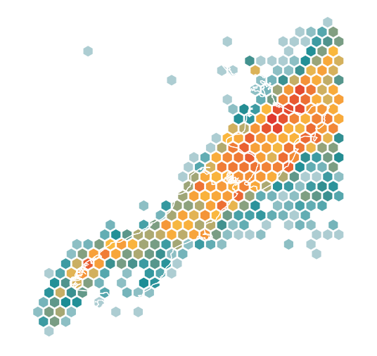
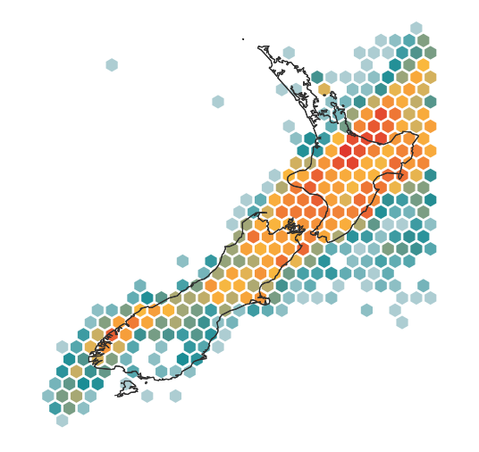
A hexagonal grid is not only visually striking, but can also approximate the contours of land and political borders more naturally than a rectangular grid. Here, earthquake frequency determines each cell’s colour on a symmetric logarithmic scale.
# Arranging points in a hexagonal grid
A typical heatmap uses rectangle marks arranged in rows and columns. Hexagonal cells form staggered rows, which we can describe using axial coordinates to identify each cell with two integers, q and r. A point at each calculated centre can then establish our grid.
struct HexCell: Identifiable, Sendable {
    struct ID: Hashable, Sendable {
        let q: Int
        let r: Int
    }

    let id: ID
    let longitude: Double
    let latitude: Double
    let earthquakes: [Earthquake]
}

enum HexGrid {
    static func center(
        for id: HexCell.ID,
        radius: Double
    ) -> (x: Double, y: Double) {
        (
            x: radius * sqrt(3) * (Double(id.q) + Double(id.r) / 2),
            y: radius * 1.5 * Double(id.r)
        )
    }
}
Each step along q moves one cell horizontally, while each step along r moves to the next row with a horizontal offset of half a cell. Together, the two coordinates give each cell’s centre, with the radius setting the spacing so neighbouring hexagons fit together. We can illustrate the arrangement with a centre cell and its six neighbours, using a radius of one.
let gridIDs = [
    HexCell.ID(q: 0, r: 0), HexCell.ID(q: 1, r: 0),
    HexCell.ID(q: 0, r: 1), HexCell.ID(q: -1, r: 1),
    HexCell.ID(q: -1, r: 0), HexCell.ID(q: 0, r: -1),
    HexCell.ID(q: 1, r: -1)
]

let gridCells = gridIDs.map { id in
    let centre = HexGrid.center(for: id, radius: 1)
    return HexCell(
        id: id,
        longitude: centre.x,
        latitude: centre.y,
        earthquakes: []
    )
}

Chart {
    PointPlot(
        gridCells,
        x: .value("Grid x", \.longitude),
        y: .value("Grid y", \.latitude)
    )
    .symbolSize(45)
    .foregroundStyle(.indigo)
}
The default circular symbols in PointPlot allow us to see the grid before introducing the hexagonal shape, with coordinate labels identifying the seven integer pairs in the diagram.
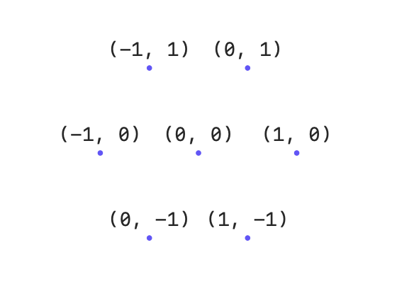
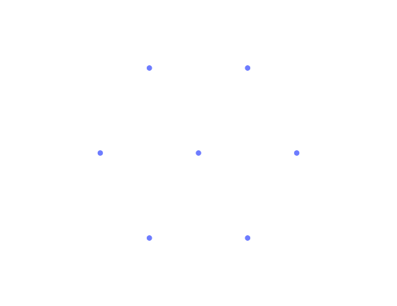
The labels show how q increases from left to right within a row, while r increases from the lower row to the upper row. Following points with the same q, we can also see the half-cell horizontal shift that accompanies each step along r, giving the grid its staggered arrangement.
# Grouping observations into cells
The sample earthquake data contains 53,763 observations from 2019–2024, prepared from the GeoNet earthquake catalogue. Grouping the observations into cells allows us to compare earthquake frequency across the region without overlapping points obscuring the distribution.
Each loaded record supplies longitude, latitude, magnitude, and depth in kilometres.
struct Earthquake: Identifiable, Sendable {
    let id: String
    let longitude: Double
    let latitude: Double
    let magnitude: Double
    let depth: Double
}
For simplicity, we can work directly with longitude and latitude, giving our cells equal areas in coordinate space. Depending on the region, an equal-area projection may be more appropriate. Reversing our centre calculation then gives fractional q and r values, which we can round to identify the containing cell.
extension HexGrid {
    static func cell(
        x: Double,
        y: Double,
        radius: Double
    ) -> HexCell.ID {
        rounded(
            q: (sqrt(3) / 3 * x - y / 3) / radius,
            r: (2 * y / 3) / radius
        )
    }
}
Rounding q and r independently may place an observation in the wrong cell near an inclined edge. We can add a derived coordinate, s = -q - r, which constrains the three values to sum to zero. After rounding all three, adjusting the coordinate with the largest rounding error restores that constraint.
private extension HexGrid {
    static func rounded(q: Double, r: Double) -> HexCell.ID {
        let x = q
        let z = r
        let y = -x - z

        var roundedX = x.rounded()
        var roundedY = y.rounded()
        var roundedZ = z.rounded()

        let xDifference = abs(roundedX - x)
        let yDifference = abs(roundedY - y)
        let zDifference = abs(roundedZ - z)

        if xDifference > yDifference,
           xDifference > zDifference {
            roundedX = -roundedY - roundedZ
        } else if yDifference > zDifference {
            roundedY = -roundedX - roundedZ
        } else {
            roundedZ = -roundedX - roundedY
        }

        return HexCell.ID(
            q: Int(roundedX),
            r: Int(roundedZ)
        )
    }
}
The correction restores the zero-sum constraint and returns an integer pair identifying the nearest hexagonal cell. With a consistent identifier for each position, we can now group the observations by cell using a dictionary.
let grouped = Dictionary(grouping: earthquakes) { earthquake in
    HexGrid.cell(
        x: earthquake.longitude,
        y: earthquake.latitude,
        radius: hexRadius
    )
}
Each dictionary entry contains the earthquakes assigned to one cell, giving us a single centre to plot and a collection whose size determines its frequency.
let cells = grouped.map { id, earthquakes in
    let centre = HexGrid.center(for: id, radius: hexRadius)

    return HexCell(
        id: id,
        longitude: centre.x,
        latitude: centre.y,
        earthquakes: earthquakes
    )
}
Only cells containing observations appear in the dictionary, so empty areas require no points in the chart.
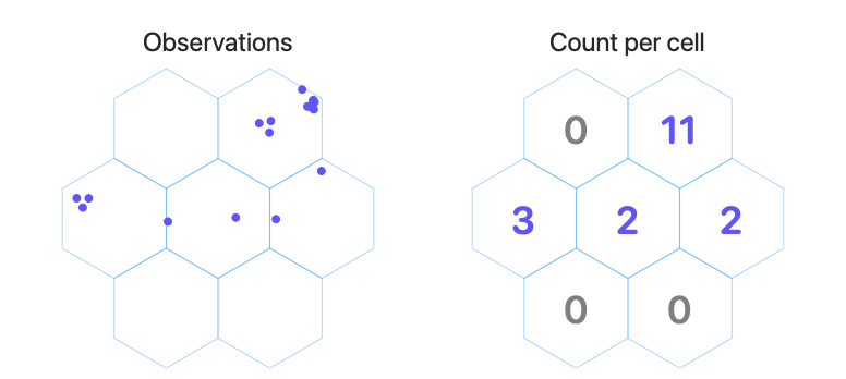
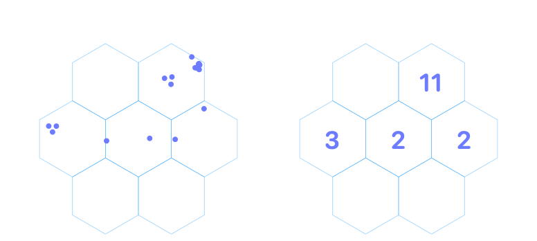
After grouping, the value at each grid centre represents the earthquake frequency across the whole cell, rather than an observation at that position.
# Showing earthquake frequency through point size
The aggregated cells can use the same point plot as our empty grid. Before introducing hexagonal symbols, we can vary the size of the circles so cells with a higher earthquake frequency appear larger.
extension HexCell {
    var earthquakeCount: Int { earthquakes.count }
}
The longitude and latitude domains define the region displayed in our heatmap. Matching the chart’s aspect ratio to the ratio of those domain widths ensures our hexagons retain their proportions and fit neatly together.
let xDomain = 164.0...180.0
let yDomain = -48.5...(-33.5)

let aspectRatio =
    (xDomain.upperBound - xDomain.lowerBound)
    / (yDomain.upperBound - yDomain.lowerBound)
We can now apply these domains and the calculated aspect ratio to our chart, using PointPlot to show the cell centres with symbol sizes representing earthquake frequency.
Chart {
    PointPlot(
        data.cells,
        x: .value("Longitude", \HexCell.longitude),
        y: .value("Latitude", \HexCell.latitude)
    )
    .symbolSize(
        by: .value("Earthquake frequency", \HexCell.earthquakeCount)
    )
    .foregroundStyle(.indigo)
}
.chartSymbolSizeScale(
    domain: 0...data.maximumEarthquakeCount,
    range: 10...200
)
.chartXScale(domain: xDomain, range: .plotDimension(padding: 0))
.chartYScale(domain: yDomain, range: .plotDimension(padding: 0))
.aspectRatio(aspectRatio, contentMode: .fit)
The symbolSize(by:) modifier maps frequency through the chart's symbol-size scale. Its range describes perceived areas in square points rather than diameters. A nonzero minimum keeps cells with a low frequency visible, so their areas are not strictly proportional to the values.
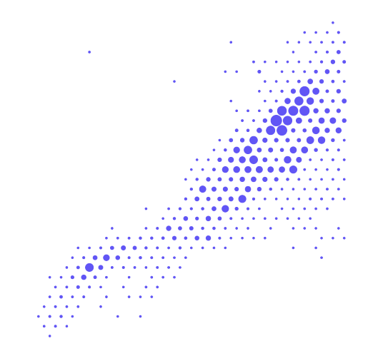
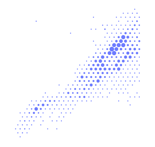
The circles show how earthquake frequency varies across the staggered grid. Larger symbols distinguish the busiest locations, while their round shapes leave the cells themselves undefined.
Turn app data into insight$35
Build clear, beautiful, and interactive visualizations with Swift Charts
Swift Charts Beyond the Basics
- Reveal patterns and relationships in complex app data
- Create custom charts that stay responsive and accessible
Turn app data into insight
Build clear, beautiful, and interactive visualizations with Swift Charts
Swift Charts Beyond the Basics
# Filling the grid with hexagonal symbols
To fill each cell, we can replace the circles with a custom symbol conforming to ChartSymbolShape, defining a six-sided path within the supplied drawing bounds.
struct Hexagon: ChartSymbolShape {
    func path(in rect: CGRect) -> Path {
        let points = [
            CGPoint(x: rect.midX, y: rect.minY),
            CGPoint(
                x: rect.maxX,
                y: rect.minY + rect.height * 0.25
            ),
            CGPoint(
                x: rect.maxX,
                y: rect.minY + rect.height * 0.75
            ),
            CGPoint(x: rect.midX, y: rect.maxY),
            CGPoint(
                x: rect.minX,
                y: rect.minY + rect.height * 0.75
            ),
            CGPoint(
                x: rect.minX,
                y: rect.minY + rect.height * 0.25
            )
        ]

        var path = Path()
        path.addLines(points)
        path.closeSubpath()
        return path
    }
}
The top and bottom corners sit at the horizontal centre, with the remaining four on the left and right edges, a quarter of the height from either end. Closing the path allows Swift Charts to fill the resulting shape.
To fit the hexagons together, we can give every symbol the same size, calculated from the cell radius and the width of our plot.
enum HeatMapStyle {
    static func symbolArea(
        in size: CGSize,
        data: PreparedEarthquakeMapData
    ) -> CGFloat {
        let renderedWidth = size.width
            / (data.xDomain.upperBound - data.xDomain.lowerBound)
            * data.hexRadius * sqrt(3)

        return max(18, renderedWidth * renderedWidth * 0.92)
    }
}
Dividing the plot width by the domain width gives screen points per degree. Multiplying that value by the cell width produces the symbol's screen-space width, which can then be squared and adjusted by a factor of 0.92 to leave a small visual separation. A minimum area of 18 square points preserves legibility; at very small chart sizes, symbols can overlap instead of continuing to shrink.
Chart {
    PointPlot(
        cells,
        x: .value("Grid x", \.longitude),
        y: .value("Grid y", \.latitude)
    )
    .symbolSize(regularSymbolArea)
    .foregroundStyle(.indigo)
    .symbol(Hexagon())
}
We can apply the calculated area with symbolSize, then replace the circles with our custom hexagon symbol. Keeping the same cell centres allows us to see how the hexagons fit into the grid.
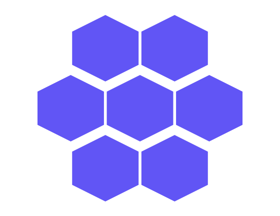
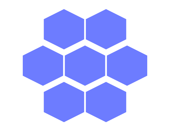
The symbols have six corners, but the staggered rows do not fit together evenly because each hexagon is too wide relative to its height. A regular hexagon in that orientation has a width of sqrt(3) / 2 times its height, approximately 0.866.
To see why Swift Charts draws the symbols this way, we can outline the drawing frame with a rectangle at the same position and symbol area.
struct SymbolDrawingFrame: ChartSymbolShape {
    func path(in rect: CGRect) -> Path {
        Path(rect).strokedPath(
            StrokeStyle(lineWidth: 1.5, dash: [4, 3])
        )
    }
}

Chart {
    // ... Existing hexagon plot ...

    PointPlot(
        cells,
        x: .value("Grid x", \.longitude),
        y: .value("Grid y", \.latitude)
    )
    .symbolSize(regularSymbolArea)
    .foregroundStyle(.orange)
    .symbol(SymbolDrawingFrame())
}
Our SymbolDrawingFrame draws a dashed rectangle around the supplied bounds. By plotting it at the same positions and symbol size as our hexagons, we can compare the shapes with their drawing bounds.
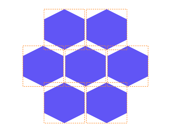
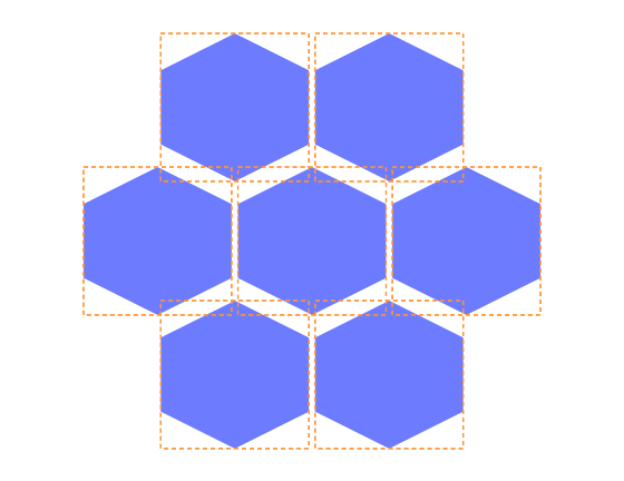
The square orange frames reveal why the symbols look broad: our path spreads all six corners across a rectangle whose width equals its height.
Because the path positions each corner relative to the supplied rectangle, we can correct the proportions in the perceptual frame without changing our drawing code.
struct Hexagon: ChartSymbolShape {
    var perceptualUnitRect: CGRect {
        CGRect(
            x: 0.067,
            y: 0,
            width: 0.866,
            height: 1
        )
    }

    // ... Existing path(in:) implementation ...
}
The narrower, horizontally centred perceptualUnitRect describes the intended proportions to Swift Charts. The path still uses the supplied rectangle, allowing the chart's symbol sizing to account for the frame.
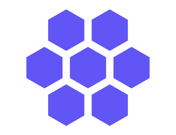
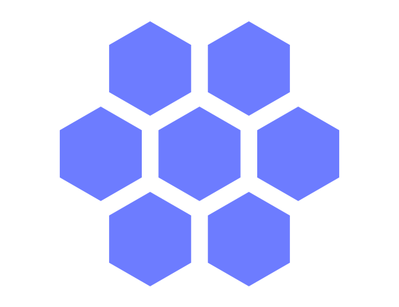
The corrected proportions allow neighbouring rows to fit together, with narrow gaps separating the symbols.
# Mapping earthquake frequency to colour
Our symbol size is determined by the grid spacing, so we can represent earthquake frequency through colour using foregroundStyle(by:).
struct HexCellsPlot: ChartContent {
    let cells: [HexCell]

    var body: some ChartContent {
        PointPlot(
            cells,
            x: .value("Longitude", \HexCell.longitude),
            y: .value("Latitude", \HexCell.latitude)
        )
        .foregroundStyle(
            by: .value("Earthquake frequency", \HexCell.earthquakeCount)
        )
        .symbol(Hexagon())
    }
}
Passing frequency to foregroundStyle(by:) allows the chart’s scale to determine each cell’s colour. We can start with a continuous gradient mapped linearly from zero to the highest frequency.
Chart {
    HexCellsPlot(cells: data.cells)
        .symbolSize(regularSymbolArea)
}
.chartForegroundStyleScale(
    domain: 0...data.maximumEarthquakeCount,
    range: Gradient(colors: [
        Color(red: 0.11, green: 0.22, blue: 0.34).opacity(0.12),
        Color(red: 0.10, green: 0.55, blue: 0.58),
        Color(red: 0.98, green: 0.72, blue: 0.24),
        Color(red: 0.88, green: 0.22, blue: 0.18)
    ]),
    type: .linear
)
A little transparency near zero allows cells with lower earthquake frequencies to recede into the background, making areas of higher frequency easier to distinguish.
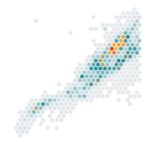
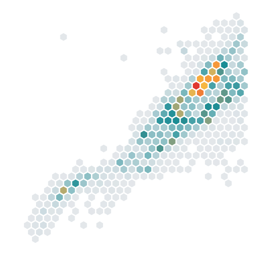
Most cells sit near the faint end of the linear gradient, making differences in earthquake frequency difficult to see. A symmetricLog scale can reveal more variation among the lower values by compressing the higher ones, while retaining support for zero. Although our occupied cells all have a frequency above zero, other aggregated metrics may include zero values.
Chart {
    // ... Existing hexagon plot with uniform symbol size ...
}
.chartForegroundStyleScale(
    domain: 0...data.maximumEarthquakeCount,
    range: HeatMapStyle.frequencyGradient,
    type: .symmetricLog(slopeAtZero: 1)
)
We can select the symmetric-log scale by setting the type parameter of chartForegroundStyleScale(domain:range:type:) to .symmetricLog(slopeAtZero: 1). The slopeAtZero parameter controls how steeply the scale changes near zero, allowing us to adjust how much of the colour range is available to distinguish lower frequencies.
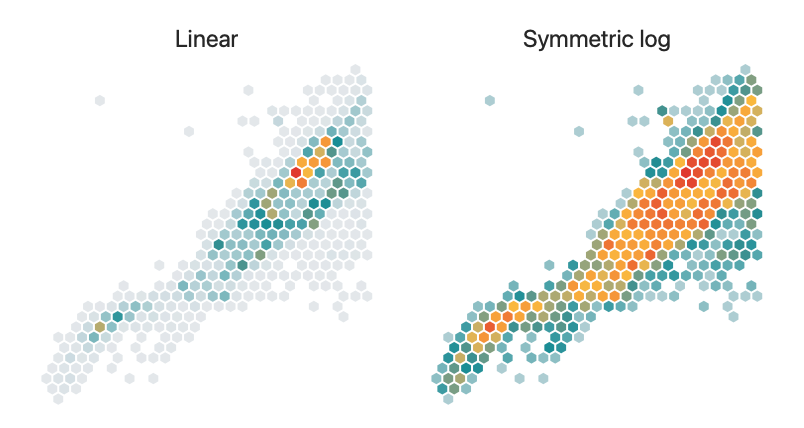
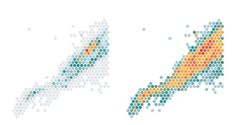
The symmetric-log map reveals more variation among cells with lower frequencies while retaining the highest frequencies at the warm end, although equal colour intervals no longer represent equal differences in frequency. A coastline outline adds geographic context to the final chart, with coordinates from GeoJSON drawn using a LinePlot. Leaving the land unfilled keeps the hexagonal cells visible on both sides of the shore.
You can find the full sample code here, including the coastline overlay and a view modifier that adapts the hexagon size as the chart resizes.
If you are looking to deepen your understanding of Swift Charts and learn how to reason about your data and turn it into beautiful, performant, and accessible charts, take a look at our new book Swift Charts Beyond the Basics. It is a rich, practical reference for building advanced data visualizations with the framework.
For more resources on Swift and SwiftUI, check out our other books and book bundles.
Turn app data into insight$35
Build clear, beautiful, and interactive visualizations with Swift Charts
Swift Charts Beyond the Basics
- Reveal patterns and relationships in complex app data
- Create custom charts that stay responsive and accessible
Turn app data into insight
Build clear, beautiful, and interactive visualizations with Swift Charts
Swift Charts Beyond the Basics